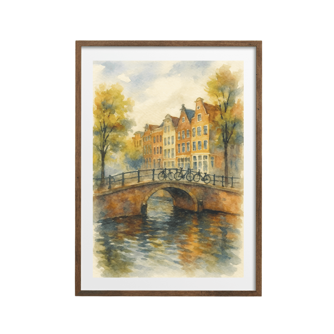



To pick a wall art colour scheme, take your colours from the sofa, rug and cushions, then use the 60-30-10 rule: about 60 percent of the print in your main room colour, 30 percent in a secondary colour, and 10 percent in an accent. Choose warm or cool tones to match the room's light.
Why is choosing wall art colours so hard?
Because most of us choose prints the way we'd choose a poster in a shop: we fall for the image and hope the colours work at home. Sometimes they do. Often the print ends up looking like it belongs in a different house. The fix is simple. Start from the room, then find the print, and use a basic proportion rule to check the match before you buy.
How do I pick colours from my sofa, rug and cushions?
Your soft furnishings already hold your colour scheme. You just need to read it.
- Start with the biggest thing in the room, usually the sofa or the bed. Note its colour. That's often your main, or dominant, colour, along with the walls.
- Look at the rug. Rugs often contain three or four colours. Pick out the one that appears most and the one that appears least.
- Check the cushions, throws and curtains. These are where most people put their accent colour, such as mustard, rust, teal or blush.
- Take a photo of the room and look at it small on your phone. The main colours stand out once the detail disappears.
- Write down three colours: the main one, a secondary one, and an accent. That's your palette for choosing art.
What is the 60-30-10 rule for wall art?
The 60-30-10 rule is a classic interior design guideline. In a room, about 60 percent is your dominant colour (walls, big furniture), 30 percent a secondary colour (curtains, a rug, a chair), and 10 percent an accent (cushions, a vase, small details).
The same rule works when you look at a print:
- 60 percent of the print should sit comfortably with your main room colour, often as the background.
- 30 percent can pick up your secondary colour.
- 10 percent can be your accent, or even a new accent that you then repeat once elsewhere in the room.
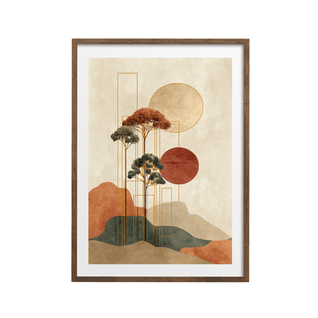
A print doesn't have to contain every colour in the room. It needs to share at least one or two, and its accent should appear somewhere else nearby. Take the geometric earth tones print: mostly cream and sand, with tan and rust shapes and a small hit of black. In a room with an oatmeal sofa, a rust cushion and a black lamp, it slots straight in.
Warm vs cool: which tones suit my room?
Warm colours (cream, sand, terracotta, mustard, rust, warm wood) feel cosy and work well in north-facing rooms that get cool, flat light. Cool colours (grey, blue, sage, crisp white, black) feel calm and fresh, and suit south-facing rooms that are already full of warm sunlight.
Check your undertones, too. A grey sofa can lean warm (greige, with a hint of brown) or cool (blue-grey). Prints with a creamy background suit warm undertones; prints with a bright white or blue-grey background suit cool ones. If your walls are one colour all over, there's more help in colour drenching and wall art.
Room palettes and the print styles that match them
| Room palette | 60 / 30 / 10 | Print style to look for | Example |
|---|---|---|---|
| Warm neutral | Oatmeal / sand / rust | Earthy geometric shapes or abstract painting | Earth tones abstract painting |
| Sage and cream | Cream / sage / white | Soft florals and botanical shapes | Impressionist magnolia |
| Fresh green | White / sage / black | Graphic leaf and plant cut-outs | Sage abstract botanical |
| Monochrome Scandi | White / beige / black | Black brushstrokes or bold shapes on cream | Beige and black abstract |
| Mustard accent | Cream / grey / mustard | Warm yellow botanicals or figures | Mustard botanical line art |
| Coastal blue | White / navy / sand | Ocean themes, blue line work, blueprints | Celestial whale in indigo |
What if my room has no clear colour scheme?
Then the print can set one. Choose a print you love, pick out its 10 percent accent, and repeat that colour twice more in the room: a cushion and a vase, or a throw and a book stack. Three small touches of the same colour make the print look planned. The warm golden yellows print is a good starting point for this, because the yellow is easy to echo with a single cushion.
If you'd rather play it safe, go monochrome. A black and cream print such as the black on cream abstract suits almost any palette because it doesn't compete with anything. My full process for choosing a print for a living room is in how I choose an abstract art print for a living room.
How does the 60-30-10 rule work on a gallery wall?
With several prints, apply the rule to the whole wall instead of to each frame. Roughly 60 percent of the prints should share your main tone, usually a cream, white or sand background. About 30 percent can carry the secondary colour, and the last 10 percent, often one or two small frames, can hold the accent. In practice, for a wall of eight prints:
- Five prints on a similar pale background with neutral drawings or photographs.
- Two prints in your secondary colour, such as sage or soft blue.
- One small print in the accent colour, placed off-centre so the eye travels across the wall.
Step back and squint. If one colour jumps out in a single corner, move a print that shares it to the opposite side so the colour is spread across the wall.
Does the frame colour change the colour scheme?
A little. Frames count as part of your 10 percent detail. Black frames sharpen a print and link to black accents like lamps and picture lights. Wood frames warm a print up and tie in with wooden furniture or floors. White frames keep things light. Many Spade22 prints come framed in black, white, wood or dark wood, so match the frame to the material you already have most of in the room.
Shop the look


See more in the abstract art collection and the botanical prints collection. Prints start at £9.99.
Quick answers
How do I choose wall art colours for my living room?
Take three colours from your sofa, rug and cushions, then look for a print that shares at least two of them. Use the 60-30-10 rule to check the balance.
What is the 60-30-10 rule?
It's a guideline for balancing colour: about 60 percent dominant colour, 30 percent secondary colour and 10 percent accent. It works for whole rooms and for choosing a print.
Should wall art match the sofa?
It should share a colour with it. Pick a print where the sofa colour appears in the background or as a secondary shade.
Are warm or cool colours better for wall art?
Warm tones suit cool, north-facing rooms and cosy spaces. Cool tones suit bright, south-facing rooms. Match the undertone of your main furniture.
What colour wall art goes with everything?
Black and cream, or black and white, prints go with almost any colour scheme. Soft sage and sand are close behind.