


How I Choose an Abstract Art Print for a Living Room (A Designer's Honest Process)
I've lost count of how many living rooms I've walked into where everything is almost right. The sofa's lovely, the rug ties the floor together, the lighting is warm. And then you look up at the wall above the sofa and there's… nothing. Or worse, a tired canvas the previous owners left behind. Nine times out of ten, the thing that finally makes a room feel finished is the right abstract art print for the living room. Not a painting that costs more than the sofa - just the right print, in the right spot, at the right scale.
So let me walk you through how I actually choose one when I'm standing in a client's space. No design-school jargon, I promise.
Start with the wall, not the art
This is the bit most people get backwards. They fall in love with a print first, then try to shoehorn it into a wall that's the wrong size. I do it the other way round. I look at the wall — usually the one behind or facing the sofa — and I ask: is this a "one big statement" wall or a "gallery of smaller pieces" wall?
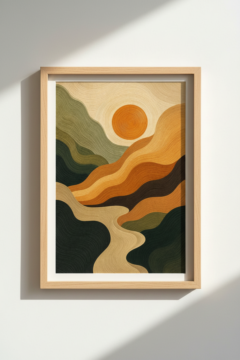
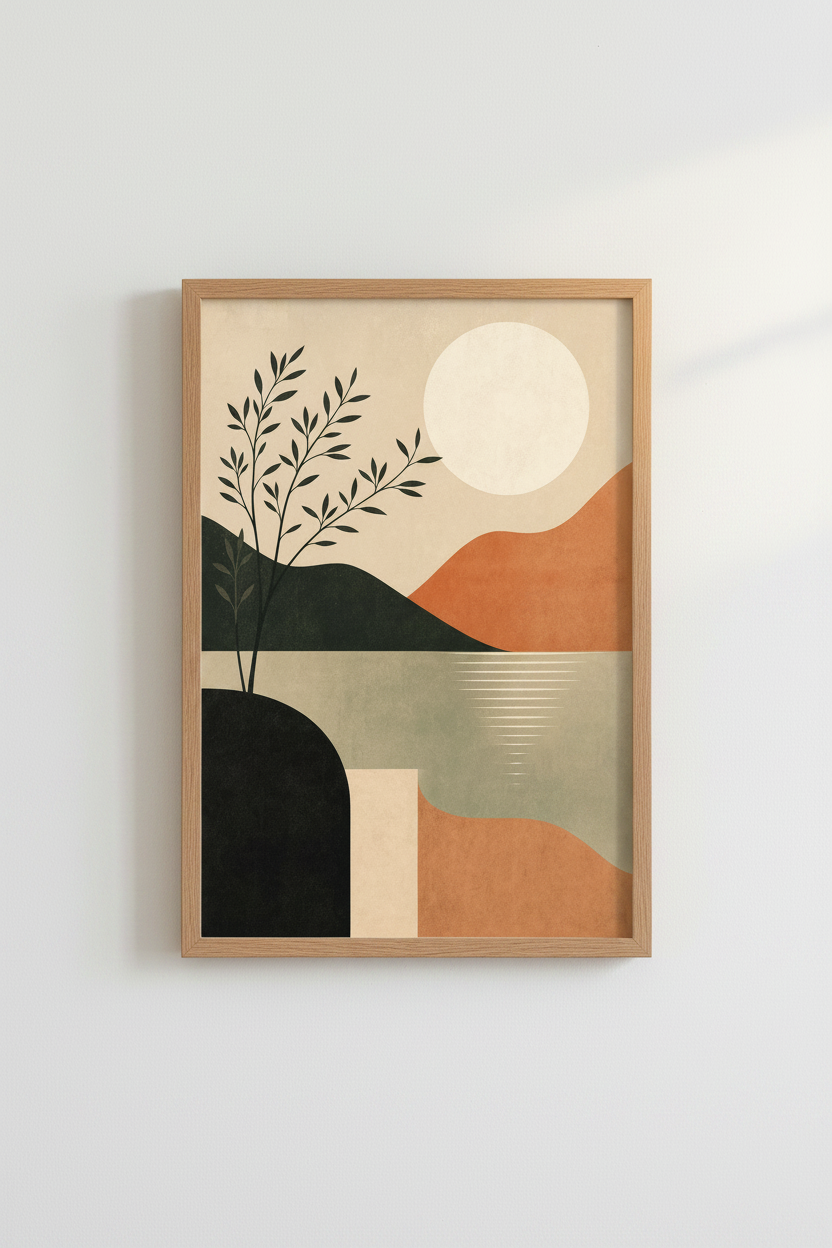
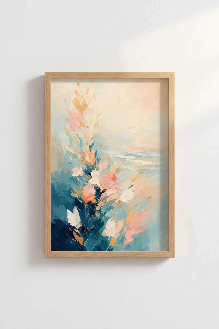
A long, uninterrupted wall behind a three-seater sofa? That wants one large, confident piece. Something like this abstract landscape in warm tones with silky hills does the job beautifully because the soft horizontal movement echoes the length of the sofa instead of fighting it.
A wall broken up by a doorway or a radiator? That's where I'll cluster two or three smaller prints instead.
Designer rule of thumb: your art should fill roughly two-thirds of the width of the furniture beneath it. A tiny A4 print floating above a big sofa always looks like an afterthought.
Let the room tell you the palette
Here's where I see people overspend on a print that then sits in a drawer. They pick a colour they love rather than a colour the room loves. Those aren't always the same thing.
I pull two or three colours that already exist in the space - a cushion, the curtains, the wood of the coffee table - and I look for a print that picks up at least one of them. You don't want a perfect match (that looks like a showroom), you want a conversation.
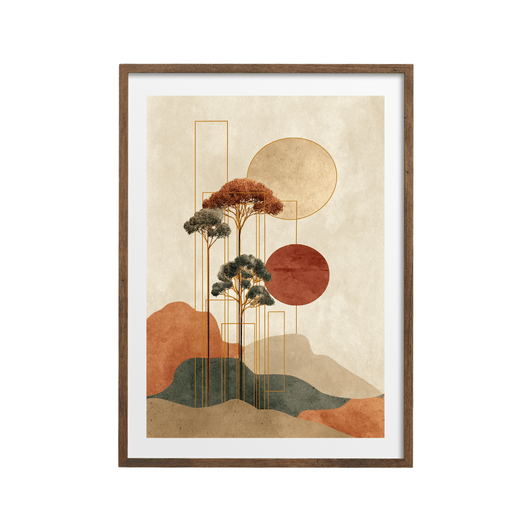
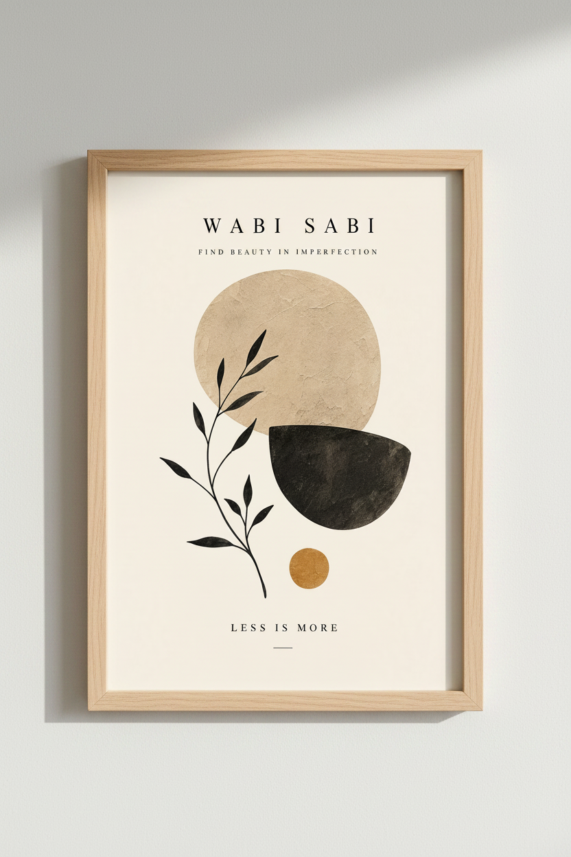
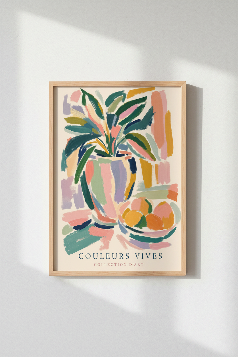
For warm, earthy rooms with timber and linen, I lean on neutrals. A neutral abstract print in soft beige with black accents is one of my safest recommendations - it adds shape and contrast without shouting. For a room that's already quite calm and could use a lift, I'll bring in a colourful abstract with a vase still-life to inject some personality.
And if a client tells me they want the room to feel restful - which is most of them - I almost always end up showing them a pastel impressionist print with calming hues. Soft colour does a lot of quiet work.
Match the print to the mood you want
Abstract art is brilliant because it sets a tone without being literal. So I always ask my client one question: when you walk into this room after a long day, how do you want to feel?
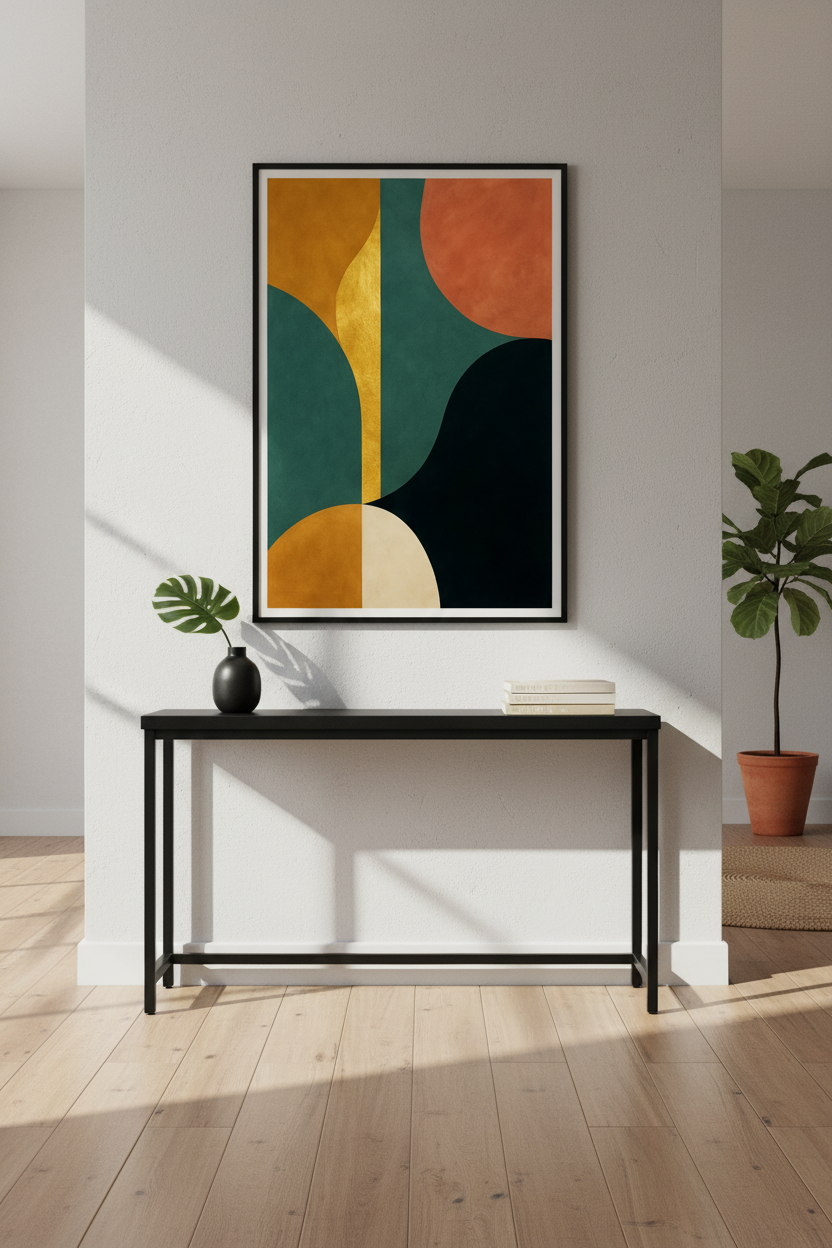
- Energised and a bit playful? Mid-century geometry is your friend. This retro Bauhaus geometric print in teal, orange and gold brings instant character to a flat wall.
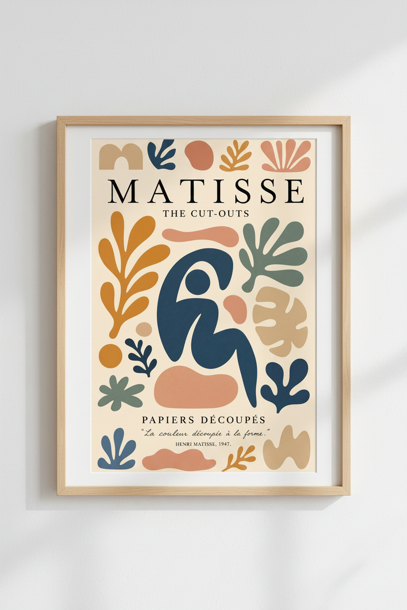
- Warm and gallery-like? Organic shapes do this best. A Matisse-inspired print with warm cut-out shapes feels collected and considered, like you've owned it for years.
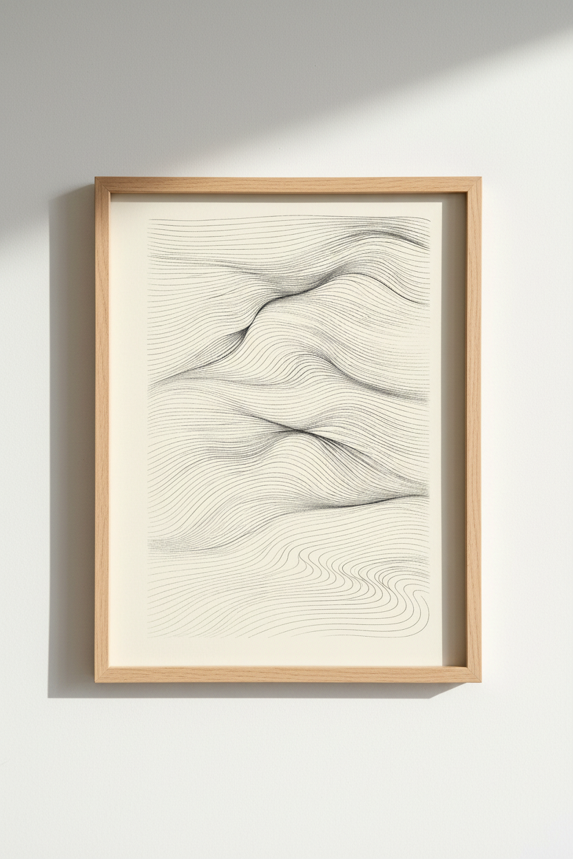
- Calm and grounded? Go for movement without colour. An abstract line-art print of monochrome waves is endlessly easy to live with.
Building a gallery wall (the easy way)
If you've got the wall for it, a small grouping nearly always looks more expensive than a single print — and it's far more forgiving to hang. My go-to is a loose three-piece arrangement that shares a feeling rather than a perfect colour match.
Here's a combination I've used in real homes that just works — keep the frames identical and let the art do the talking:
The trick is to keep the frames consistent — same colour, same style — even when the art is varied. Consistent frames are what turn "a few posters" into "a curated wall."
A few practical things people forget
A couple of unglamorous tips that save real headaches:
Hang it lower than you think. The centre of your art should sit around eye level - roughly 145–150cm from the floor. Most people hang art far too high, which leaves an awkward gap above the sofa.
Mind the frame and the light. Glossy frames in a sunny room will fight you with glare all afternoon. In bright living rooms I lean toward matte finishes.
Buy the size up if you're torn. I have honestly never had a client say "I wish I'd gone smaller." A slightly larger print almost always reads as more confident and intentional.
Shop the edit
If you'd rather just browse my living-room favourites from the collection, here they are in one place — tap any one to see sizes and framing options:
The bottom line
Choosing an abstract art print for your living room isn't about finding the "best" piece - there's no such thing. It's about finding the piece that suits your wall, your palette, and the way you want the room to feel. Start with the wall, borrow a colour the room already loves, and pick a mood. Do that, and even a £9.99 print can make the whole space click.
If you're not sure where to begin, the full abstract art collection is a good place to lose half an hour - start with the living-room-friendly neutrals, and trust your gut from there. The right one tends to make itself