





Colour drenching is one of my favourite things to happen to British homes in a long time. If you haven't come across the term, it means painting a room in one colour from top to bottom: walls, skirting boards, ceiling, and often the doors, window frames and radiators too. Sometimes it's the exact same shade everywhere, and sometimes it's two or three very close shades of the same colour. The edges of the room blur, and the space feels cocooning, even a small one.
The question I get straight after someone finishes a drenched room is always the same: what on earth do I hang on the walls now? Here's how I think about it.

First, decide what the art is for
In a white room, art usually brings the colour. In a drenched room, the walls already have all the colour you could want, so the art has a different job. It either sinks into the scheme and adds texture and depth, or it stands out and gives your eye somewhere to land. Both work. What doesn't work is being halfway, with a print that's neither close enough to blend in nor different enough to stand out, so it just looks like a slight mistake.
Before you buy anything, stand in the room and decide which way you're going. It makes the choice much quicker.
Tonal prints: the quiet route
A tonal print uses colours from the same family as your walls, just lighter, darker or more textured. This is the route for people who did the drench because they wanted a calm, enveloping room and don't want anything to break the spell.
In a deep, dark room (inky blue, charcoal, aubergine, a dark olive) I like a moody abstract with lots of texture and not much contrast. The monochrome textured abstract works well here, because the interest comes from the surface and the layering. In a dark room it reads almost like a relief on the wall.
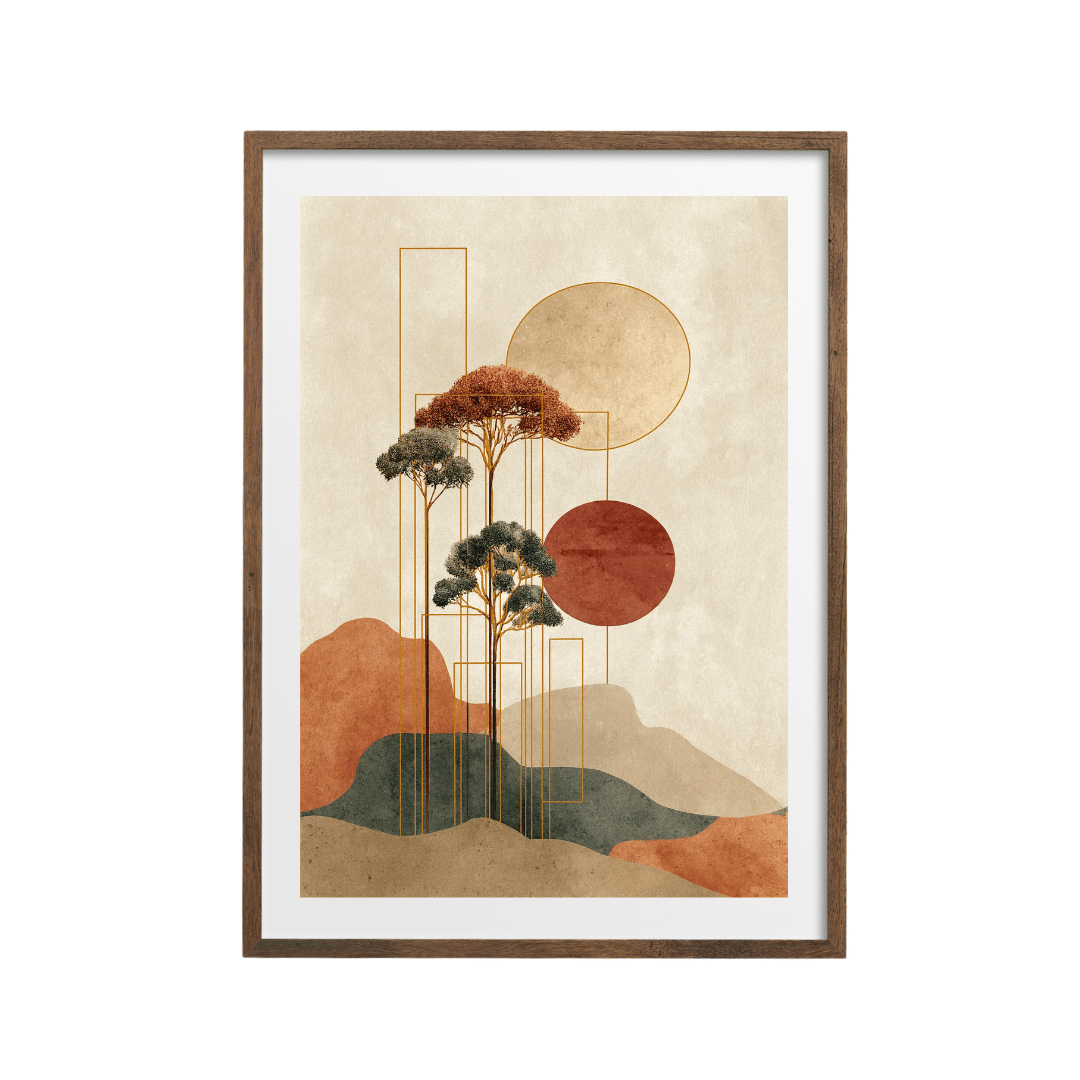
In a warm drench, say terracotta, plaster pink or a rusty orange, look for prints that sit in those same warm tones. The warm abstract in orange and blush or the warm earthy abstract would melt nicely into a pinky clay wall.

Green drenches are everywhere at the moment, and sage in particular. Soft green botanicals and abstracts sit beautifully against them. The sage green abstract botanical is a good example: it has enough variation in it to show up, but it feels like part of the room.
One thing to watch with tonal art is that it can disappear entirely if it's too close to the wall colour. I hold a sample card next to the print image on my phone. If I can barely tell the two apart, I go a shade lighter or darker.
Contrasting prints: the confident route
The other approach is to pick something that stands apart from the walls. In a drenched room, contrast is very powerful, because there's nothing else competing. One strong print on a single-colour wall gets all the attention.
Contrast doesn't have to mean bright. In a deep green or navy room, a print with a lot of black and gold, like the black and gold textured abstract, gives you a warm glow against the dark wall without fighting the mood. In a soft, pale drench such as a buttery yellow or a light blue, I'd go for graphic shapes and stronger colour. The retro groove wave print or the Bauhaus primary colour print would stand up well.
A simple way to find a good contrast is to look at the colour wheel and go roughly opposite your walls. Blue walls love a bit of orange or rust. Green walls look great with pinks and reds. It is only a rough guide, so trust your eye too.

Frame colour matters more than usual
In a white room, a frame is mostly just a frame. In a drenched room, the frame is the line between your art and a wall of solid colour, so it has a lot more influence on the result.
Oak and natural wood
Oak is my default for drenched rooms in warm or earthy colours: greens, terracottas, mustards and warm neutrals. The wood adds a little warmth and texture, and it connects to wooden furniture and floors. It's also forgiving if you change the wall colour in a couple of years.
Black
A black frame gives a crisp edge, which is useful for contrasting prints and pale drenches. In a very dark drench, black frames can disappear into the wall, which can look smart with a tonal print but tends to dull a bright one. Hold the frame up against the wall before you commit.
A frame painted to match
This is the full-commitment option and my favourite trick for a drenched room. Paint a plain wooden frame in the same colour as the walls, using the leftover tin. The frame vanishes, and the print looks as though it's set into the wall. It works best with a strong contrasting print, because the art then floats on a single block of colour. Use a primer on the frame first and let it dry properly before the print goes in.
White mounts: yes or no?
A white mount (the card border between the print and the frame) is a classic choice, and in a white room you barely notice it. In a drenched room you notice it a lot. A wide white mount creates a bright border that separates the art from the wall, which can look fresh and gallery-like in a dark room.
It can also look a bit stark, especially with a tonal print you were hoping would blend in. My rough rule is this. If you're going tonal, skip the white mount or use an off-white or coloured mount. If you're going for contrast, a white mount can help, especially in a dark drench where it frames the print with a band of light.
Whichever you choose, keep it consistent across the room. Mixing mounted and unmounted prints on the same drenched wall looks muddled.
Scale and placement
Drenched rooms tend to suit fewer, larger pieces. A busy gallery wall breaks up the block of colour that made the room feel special. One big print, or a pair, usually does the job. Over a sofa or sideboard I still aim for roughly two-thirds the width of the furniture, with the centre of the art around 145 to 150 cm from the floor.
If you'd like to try a few options, the abstract art collection has plenty of both tonal and contrasting pieces, the minimalist poster collection is good for simpler graphic shapes, and the framed prints collection saves you a trip to the framer. I keep a paint sample next to the screen while I browse, and I suggest you do the same.