

Typography posters stop looking cheesy when the words are short, the font fits the room, and there's plenty of empty space around the text. Aim for five to eight words at most, one typeface (two at a push), and a calm colour palette. Kitchens, hallways and home offices are the easiest rooms for words on the wall.
Quote prints have a reputation problem. Everyone has seen the "Live Laugh Love" sign in a curly script, and it's made a lot of people nervous about putting words on their walls at all. That's a shame, because good typography can be some of the most personal and graphic art in a home. The difference between a print that feels considered and one that feels like a gift shop souvenir is mostly about a few choices you can learn to spot.
What makes a quote print look cheap?
In most homes I see, the quote prints that don't work have the same few problems:
- Too many words. Once you're past ten or twelve words, it reads as a paragraph and people stop looking.
- Too many fonts. Three or four typefaces fighting for attention on one A4 sheet looks busy.
- Generic sentiments. Words that could hang in anyone's house don't say much about yours.
- Decorative script for everything. Swirly handwriting fonts can be lovely in small doses, but a whole sentence in them is hard to read and dates fast.
- Instructions. A room full of signs telling you to relax, dance, smile and be grateful starts to feel like a waiting room.
Choosing typography posters by font
The typeface does as much work as the words. It sets the mood before anyone has read a thing.
| Font style | What it feels like | Rooms it suits |
|---|---|---|
| Classic serif (spaced capitals) | Calm, literary, a bit grown up | Living rooms, bedrooms, studies |
| Bold condensed sans serif | Direct, energetic, graphic | Home offices, gyms, hallways |
| Typewriter | Quiet, personal, slightly wry | Bedrooms, reading corners, desks |
| Chunky retro display | Warm, playful, 1970s | Kitchens, living rooms, kids' rooms |
| Hand lettered | Friendly, informal | Kitchens, hallways, utility rooms |
Serif fonts for calm rooms
A widely spaced serif in black on white is the easiest typography to live with. It looks like the title page of a book. The "Good things take time and that is okay" serif print works because there's so much air around the words. A "Silence is a source of great strength" print in the same collection takes it further, with one word per line in small, spaced capitals. From across the room it reads almost as a texture.
Typewriter fonts for a softer, wittier feel
Typewriter type has a handmade, slightly private quality, as if it's a note left for you. The typewriter quote print on cream is a good example. It reads as a gentle joke, so it never feels preachy.
Bold display and retro fonts for energy
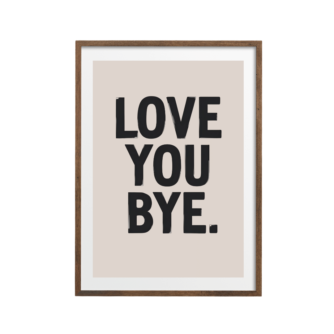
Chunky, rounded, 1970s style lettering is having a long moment, and it suits kitchens and living rooms with warm colours. Keep the wording short. Three or four words in a heavy display font can carry a whole wall.
How to pick words you won't get tired of
I'd put the wording through a quick test before you buy anything:
- Read it aloud. If it makes you cringe slightly, it'll make you cringe more in six months.
- Count the words. Five to eight is the sweet spot. One to three can be even stronger.
- Check it's yours. Does it relate to how you live, a phrase you actually say, a place you love, or a joke your household gets?
- Avoid commands where you can. Observations ("Good people live here") age better than orders ("Live, love, laugh").
- Try a different language. A short phrase in Italian, French or Portuguese can feel more like art and less like advice, as long as you know what it means.
The "Kind people are my kind of people" print passes this test well. It's warm, it's a small play on words, and it's set in a quiet beige palette with the text running down one side, so it reads as a composition.
Mixing typography with images
One of the easiest ways to stop a quote print looking cheesy is to choose one where the words and an image work together. The image gives your eye something to rest on, and the words read like a caption.
- The "Good things take time" retro sunset print pairs chunky lettering with a simple sun and wave graphic.
- The "Good people live here" woodcut print sets bold letters against a tree and bench in a linocut style and has a hand-cut, crafted look.
- The "Menos rush, mais alma" print puts a sun and open hands under heavy serif capitals.
If you're building a gallery wall, typography also works well as one piece among several images. One word print to every four or five pictures is about right. Any more and the wall starts talking over itself. I've written more on balancing a mixed wall in building a gallery wall from prints that don't match.
Best rooms for typography posters
Kitchens
The kitchen is the most forgiving room for words. Food and drink phrases feel natural there, and the tone can be lighter than anywhere else in the house. Something like the "Cook happy, live tasty" tomato print works because it's cheerful and the red tomato does half the job. If you like the café look, my piece on Italian café style for a small kitchen has more ideas.
Hallways
Hallways are where guests arrive, so a welcoming phrase makes sense. People pass through quickly, so keep it short and readable from two or three metres away. A 30x40 cm or A3 print hung with its centre around 150 cm from the floor is a good starting point in a narrow hall.
Home offices
An office can take something more direct. The "Discipline today, freedom tomorrow" serif print has a motivational message, but the restrained serif type and white space keep it from shouting. The "Overthink less, make mess, be kind" print is a looser, hand-lettered option for creative desks.
Bedrooms and living rooms
These are the trickiest rooms for words because you spend long, quiet hours in them. Go for very calm typography (spaced serif, small type, lots of space) or one short phrase in a colour that matches your scheme, like the "Good days build brave souls" sunburst print in terracotta on beige.
Sizing and framing words on the wall
Words need to be readable from where you'll usually see them. As a rough guide:
- A4 or 21x29.7 cm: shelves, desks, small bathrooms, viewed from 1 to 2 metres
- A3 or 30x40 cm: hallways, kitchens, above a desk
- 50x70 cm: above a sofa, sideboard or bed, where the print is the main piece
Most prints come in sizes from 13x18 cm up to 60x90 cm. For monochrome typography, a black or white frame keeps things crisp. Retro and warm-toned lettering looks better in oak. A white mount around a small quote print makes it look far more like art and less like a sign.
You can browse the full typography and quotes collection to find the wording that sounds like you.
Shop the look


Quick answers
Are quote prints out of fashion?
Generic slogans in swirly script have dated, but well set typography hasn't. Short wording, a clean font and plenty of space look current.
How many words should a typography poster have?
Five to eight words is a good target. One to three words can be even stronger, and anything over twelve starts to read as a paragraph.
Where should I hang a quote print?
Kitchens, hallways and home offices are the easiest rooms. Hang it at eye level, with the centre around 145 to 150 cm from the floor.
What frame suits typography?
Black or white frames suit monochrome text. Oak suits warm, retro or earthy lettering. A white mount makes a small quote print look more like art.
Can I mix typography with other art?
Yes. On a gallery wall, use about one word print to every four or five images, and pick one that shares a colour with the rest.