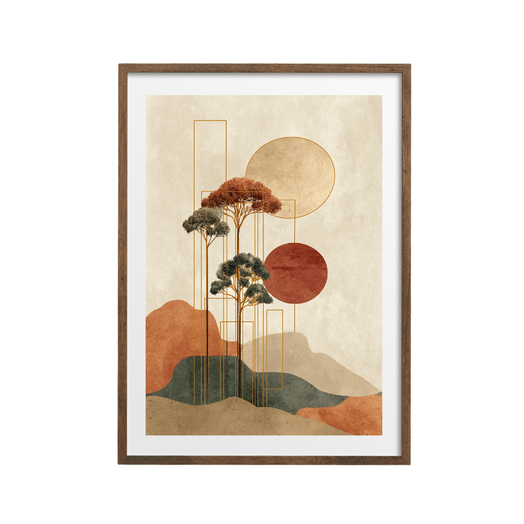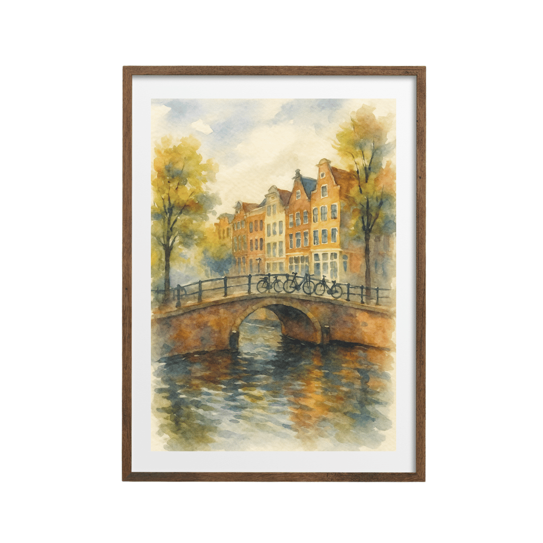






How to choose a picture frame comes down to three things: your floors and furniture, the colours in the print, and the wall behind it. Match the frame to the nearest wood or metal in the room, then check it against the print. Black suits graphic and monochrome art, white suits pale schemes, oak suits soft, natural prints.
Most people pick a frame by looking only at the print. That's half the job. The frame sits between the art and the room, so it has to get along with both. A frame that flatters the print but clashes with your oak floor and walnut sideboard will look wrong every time you walk in, and you'll struggle to say why.
Start with the room, not the print
Before you look at frame options, look at what's already in the room. In most homes I see, the frame decision gets easy once you notice which materials are doing the talking.
- Look at the floor. Pale oak, mid oak, dark wood, grey laminate, tiles and carpet all push you in different directions.
- Look at the biggest piece of furniture near where the art will hang. A sofa, a sideboard, a bed frame, a desk.
- Look for metal finishes: black curtain poles, brass lamp bases, chrome door handles, the legs on a coffee table.
- Look at the wall colour. Is it warm (cream, magnolia, plaster pink) or cool (grey, white with a blue tint, sage)?
- Pick the frame that repeats something from steps 1 to 3 and sits comfortably against the colour from step 4.
That repetition is what makes a room look put together. A black frame echoes black curtain poles. An oak frame picks up an oak floor. A dark wood frame ties into a walnut sideboard. You don't need an exact match, just a family resemblance.
Black, white, oak or dark wood: which frame suits which room?
Many prints on Spade22 offer black, white, wood and dark wood frames, or unframed if you have frames already. Here's how I'd think about each one.
| Frame | Best rooms | Works with floors and furniture | Best print styles |
|---|---|---|---|
| Black | Living rooms, home offices, hallways, kitchens | Grey floors, black metal fittings, industrial or modern furniture | Black and white photography, typography, Bauhaus and geometric, bold colour |
| White | Bedrooms, nurseries, bathrooms, small rooms | White furniture, pale painted floors, Scandi schemes | Watercolour, pastel abstracts, soft botanicals, coastal |
| Oak (light wood) | Living rooms, bedrooms, Japandi and Scandi spaces | Light oak floors, rattan, linen, pale wood furniture | Neutral abstracts, line art, botanicals, earthy and boho prints |
| Dark wood | Studies, dining rooms, traditional living rooms | Walnut, mahogany, dark oak, leather, mid-century furniture | Vintage, still life, oil painting styles, warm landscapes, retro |
Black frames
Black is the safest all-rounder, which is why it's so popular. It gives a print a clean edge, works on almost any wall colour, and makes graphic art look sharper. It's particularly good with black and white photography, like the woman at a Paris window print, and with strong geometric pieces like the Bauhaus geometric print or the primary colour geometric print.
The one place I'd hesitate is a room that's all soft, warm neutrals with no black anywhere. A black frame there can look like a full stop in the middle of a sentence. If you love it anyway, add one or two other black accents (a lamp, a plant pot, a picture light) so it has company.
White frames
White frames almost disappear on a white or pale wall, which makes the print look as if it's floating. That's lovely for delicate watercolours and pastel abstracts, and it's useful in small rooms where you want things to feel light. On a dark painted wall, a white frame gives a crisp gallery look.
Where white struggles is next to warm wood. A bright white frame beside an oak floor and oak furniture can look a bit cold and clinical.
Oak and light wood frames
Oak is my go-to for neutral, natural schemes. It warms up a print without competing with it, and it suits the earthy palettes that are everywhere at the moment: sand, terracotta, sage, ochre. Botanicals like the Atelier du Vert herbarium print and Japanese-inspired pieces like the zen crane print look right in oak because the frame continues the natural feel of the artwork.
If your floor is a very orange-toned pine or a yellowish laminate, check the frame against it. Two different wood tones side by side can fight. Sometimes black or white is the calmer answer.
Dark wood frames
Dark wood adds weight and a slightly traditional, collected feel. It's brilliant with mid-century furniture, leather chairs and walnut sideboards, and it suits prints with warm, deep colours or a vintage look, like the textured vintage rose print. In a small, pale room, though, one dark frame is usually enough.
How to choose a picture frame to suit the print itself
Once the room has narrowed your options to two, let the print decide.
- Pull a colour from the darkest part of the print. If the print has strong black lines or shapes, a black frame will feel like part of the artwork.
- If the print has a cream or off-white background, a white frame can look slightly grey next to it. Oak or black usually sits better.
- Soft, blurry, painterly prints suit thinner, lighter frames. Heavy black frames can make them look boxed in.
- Graphic, high contrast prints can carry a bolder frame without looking crowded.
- Very dark prints, like the black textured abstract, can disappear inside a black frame on a dark wall. Oak gives them a visible edge.
If you're building a gallery wall, choose one frame colour for most of the frames and allow yourself one or two exceptions. I've gone into more detail on mixing in building a gallery wall from prints that don't match.
What does a mount add to a framed print?
A mount is the card border between the print and the frame. It makes more difference than people expect.
It gives the print space
Without a mount, the edge of the artwork runs straight into the frame. With one, there's a band of calm around the image, which makes it look more considered and a bit more expensive. Compare the orange and blush abstract in its mount with an unmounted print and you'll see the difference straight away.
It makes a smaller print look bigger
An A4 print in a 30x40 cm frame with a mount reads as a 30x40 cm piece on the wall. That's useful when a print only comes in a smaller size, or when you want a set of different sized prints to line up in matching frames.
It keeps the print off the glass
A mount holds the paper slightly away from the glazing so the paper never presses flat against it.
How wide should a mount be?
As a rough guide, go for 5 cm on an A4 or 30x40 cm frame, 6 to 8 cm on a 40x50 cm or 50x70 cm frame, and 8 to 10 cm on anything bigger. Wider mounts look more gallery-like. Very thin mounts (under 3 cm) tend to look like a mistake.
White or off-white is the default colour for a reason. A coloured mount pulls focus from the print and dates quickly.
A few frame mistakes to avoid
- Choosing the frame on a screen without checking the room. Hold a swatch, a photo frame or even a piece of card in the colour against the wall first.
- Mixing four or five frame finishes in one room. Two is plenty, three at most.
- Frames that are too heavy for the print. A wide, dark frame around a small, delicate print swamps it.
- Forgetting the hardware. A black frame next to brass light switches and gold lamps can feel disconnected. Look at the metals before you decide.
If you'd rather browse prints that already come framed, the framed prints collection is a good place to start.
Shop the look


Quick answers
Should a picture frame match the floor or the furniture?
It should relate to at least one of them. Matching the nearest large wooden or metal item, usually the floor or the piece of furniture under the art, makes the frame look intentional.
Is a black or white frame better?
Black suits graphic, monochrome and colourful prints and most wall colours. White suits soft, pale prints and light schemes, and almost vanishes on a white wall.
Do oak frames go with grey walls?
Yes, especially warm greys. Oak adds warmth to a cool grey scheme. On a very cold blue-grey, black or white may look cleaner.
Should every frame in a room match?
No, but keep it to two finishes, three at most. One main frame colour with a single contrast piece looks deliberate.
Is a mount worth it?
Usually, yes. A white mount gives the print breathing space, makes it look larger and keeps the paper off the glass.