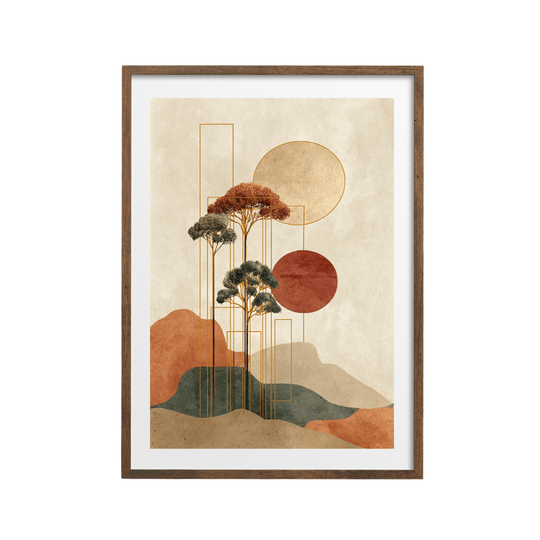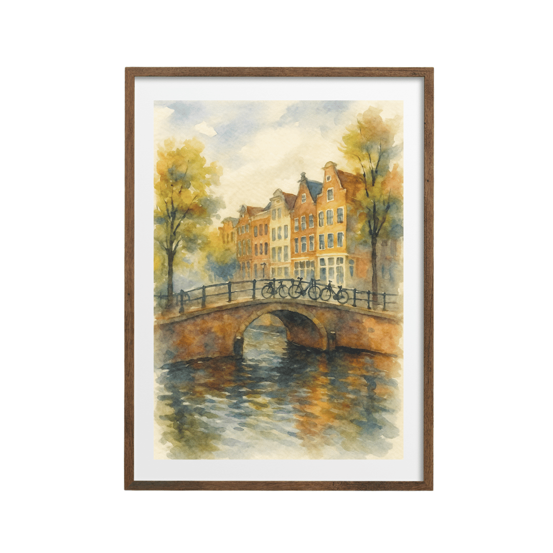






The bedroom is the one room where I'm happy to be a bit boring with art. You see that wall first thing in the morning, half awake, and last thing at night when you're trying to wind down. A loud, busy print that looks brilliant in a hallway can feel like someone shouting at you from across the duvet. So when a client asks me for bedroom art, I nearly always steer them towards a calm abstract, and then we spend most of our time on where it goes and how big it should be.
Here's how I work through it.

Why abstracts suit a bedroom
A landscape or a portrait asks you to look at something. An abstract mostly asks you to feel something, and in a bedroom that feeling should be quiet. Soft shapes, gentle texture and a narrow palette give your eye somewhere to rest without giving your brain a story to follow at 11pm.
The prints I reach for most have very little contrast. A textured abstract in beige and ivory is about as restful as wall art gets. From across the room it reads almost like a plaster finish, and up close you get the brushy detail. If your bedroom is mostly white and oak, something like this simply looks as though it belongs there.
If you'd like a hint of a horizon, abstract landscapes are a nice middle ground. This grey and beige abstract landscape has a low, flat composition that sits well above a bed, because the bed is a long, low shape too.
Above the bed or facing it?
This is the question I get asked more than any other, and the answer depends on what you want the print to do.
Above the bed is the classic spot. It anchors the bed, makes the headboard wall feel finished, and it's what you see when you walk in. The catch is that you don't really look at it once you're lying down. It's art for the room more than art for you.
The wall facing the bed is the one you actually wake up to. If you have a favourite piece, I'd put it there. It's also the better option if you're nervous about hanging anything over your head (perfectly reasonable, and more on that below). The downside is that the wall opposite a bed often has a chest of drawers, a TV or a wardrobe on it, so you may be working with less space.
In a lot of my projects I end up doing both: a wide, quiet piece above the bed and a smaller, slightly more characterful print opposite. That way the room looks pulled together when you walk in, and you still get something you like to look at with your morning tea.

Getting the scale right against the headboard
Most bedroom art I see is too small. A single A4 print centred over a king-size bed looks like a postage stamp, and the wall ends up feeling emptier than if there were nothing there at all.
My starting point is the same rule I use above a sofa: aim for the art, or a group of pieces, to cover roughly two-thirds of the width of the bed. For a standard double that usually means a single large print or a pair of medium ones side by side. For a king, a pair or a set of three often works better than one huge piece, and it's easier to get up the stairs.
Height matters just as much. I leave a gap of somewhere around 15 to 25 cm between the top of the headboard and the bottom of the frame. Too close and it looks cramped; too high and the art floats off on its own, with no connection to the bed beneath it. If you have no headboard, imagine one about 100 to 110 cm from the floor and work up from there.
A pair is a lovely option above a bed. Two prints from the same family, hung with a small gap of 5 to 8 cm between them, give you that hotel-room symmetry without feeling stiff. The soft neutrals and greens abstract landscape and the abstract meadow in soft greens would sit happily together as a pair.
Colour for sleep
I'm wary of anyone who promises a particular colour will help you sleep. What I can tell you from years of doing bedrooms is that people tend to feel calmer in rooms with low contrast and softer, slightly muted colour. Very bright reds, hot pinks and high-contrast black and white can feel energising, which is great in a kitchen and less great when you're trying to switch off.
So my bedroom palette usually comes from three families.
- Warm neutrals: oatmeal, sand, stone and ivory. They sit with almost any bedding and they flatter a room with warm bulbs.
- Soft greens: sage, olive and eucalyptus. Green tends to feel fresh without being cold, and it works with natural wood furniture.
- Muted blues and sea tones: a dusty blue or a washed-out coastal palette feels cool and airy, which can be lovely in a south-facing bedroom that gets warm.
The abstract meadow print is a good example of the green route. For the coastal look, I like this pastel seascape abstract, or the muted abstract coastal print if you want something even quieter.

A useful trick is to take one colour from your bedding or curtains and look for a print that has a little of it, but not a lot. If your duvet cover is sage, a print that is mostly sand with a few sage marks will tie things together far better than a print that is solid sage.
If you want a touch of warmth for winter, a print with a bit of gold in it can feel cosy under a bedside lamp. This soft gold abstract landscape is calm enough for a bedroom but has a bit more glow than the pure neutrals.
Practical bits for over the bed
Anything hanging above where you sleep needs to be properly fixed. I use two hooks or D-rings rather than one, so the frame can't swing or slide, and I always use fixings that suit the wall. A plasterboard wall needs plasterboard fixings, and a solid wall needs plugs. If you're unsure, ask someone who knows, or put the print on the wall opposite instead.
I also prefer acrylic glazing or a lightweight frame over the bed instead of heavy glass. It's lighter, it won't shatter, and it cuts down on reflections from the bedside lamps. A matte finish helps with glare from a window too.
And think about the lights. If you have wall lights either side of the bed, measure where they sit before you choose a width, because the frame needs a little breathing room on each side.

Where to start
If you only do one thing, measure the width of your bed, take two-thirds of it, and use that number to decide between one print and a pair. Then pick from the calm end of the palette and hang it slightly lower than feels natural.
You'll find plenty of quiet pieces in the abstract art collection, and the bedroom prints collection has a wider mix if you'd like a few options that aren't abstract to compare against. Prints start at £9.99, so trying a pair is easier on the budget than people expect.