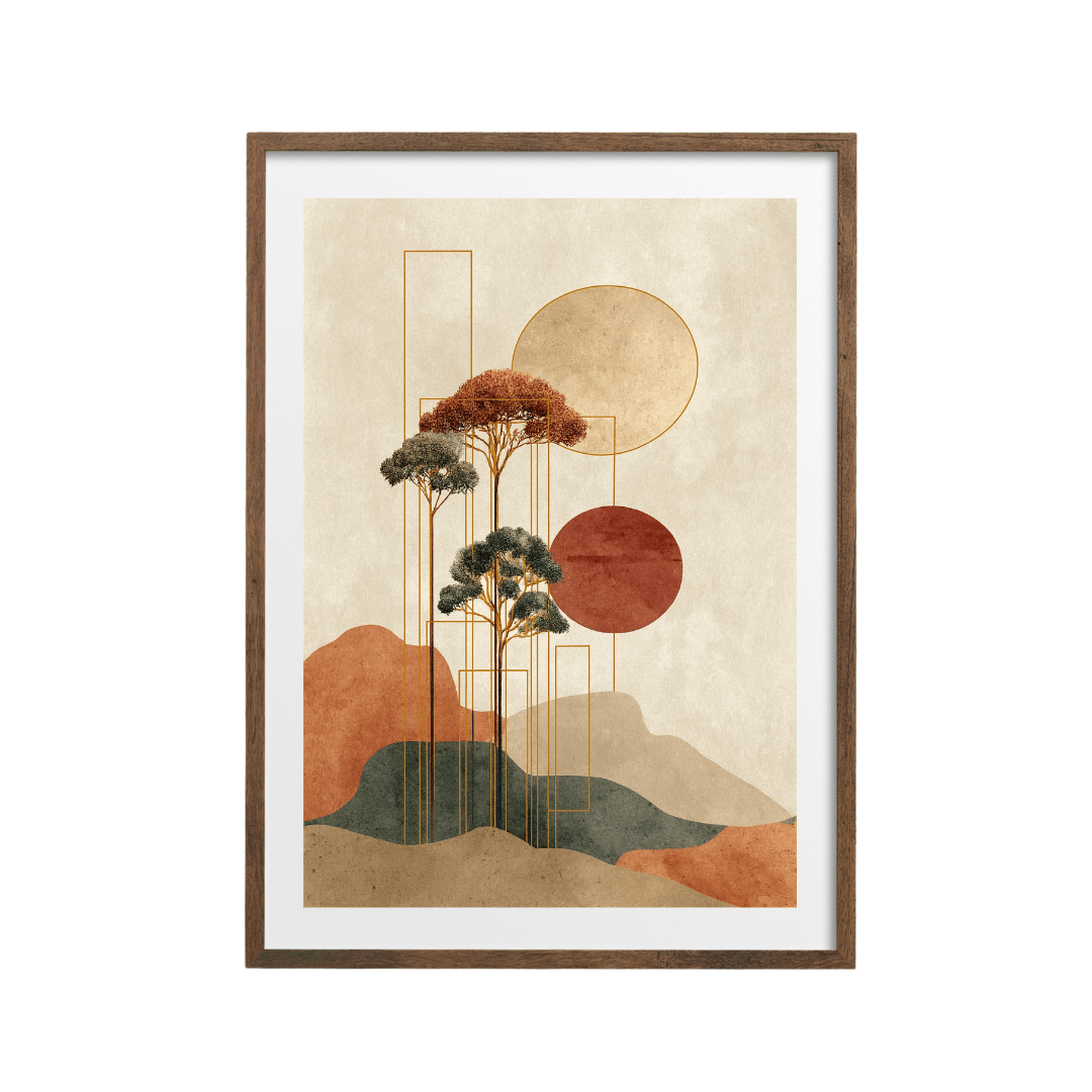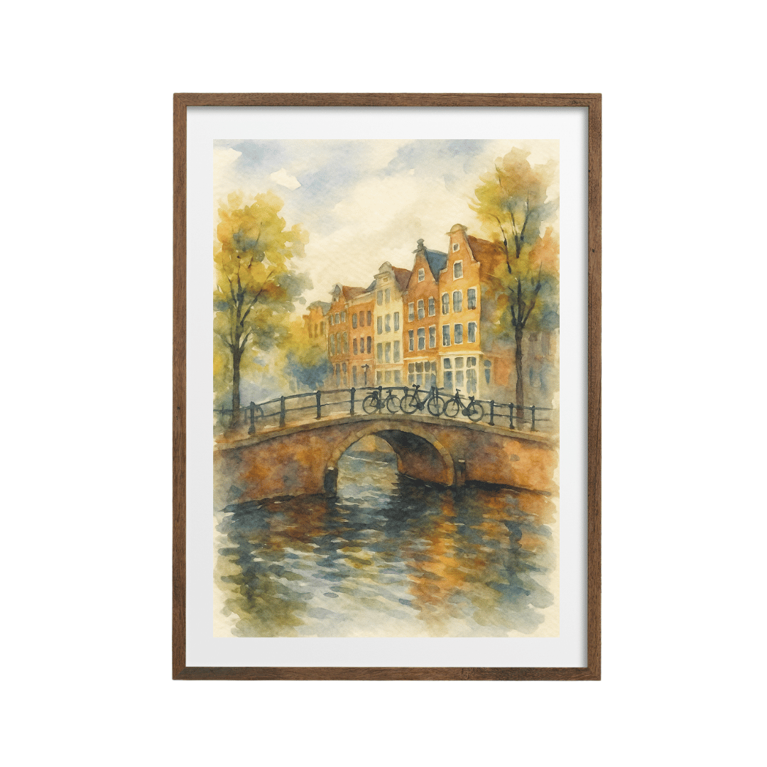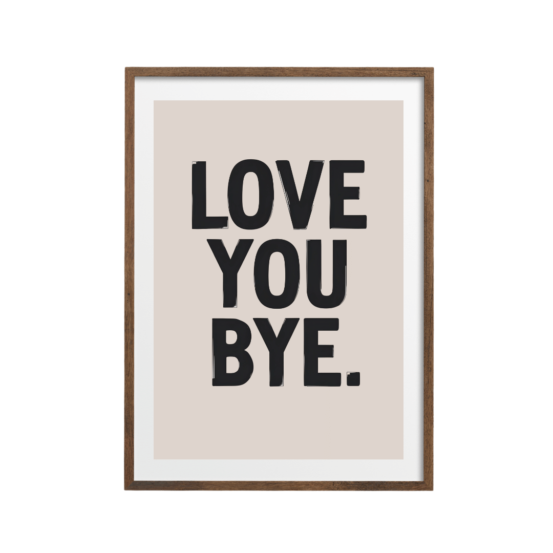



Good picture ledge styling comes down to one rule: put your largest print at the back and layer smaller ones in front so each overlaps the one behind by about a third. Use three or five pieces, add one object, and fix the ledge so the tallest print's centre sits around 145 to 150 cm from the floor.
I like ledges because they let you change your mind. You drill once, and after that a new print costs you nothing but the print. They also suit anyone renting, anyone who hates measuring for a gallery wall, and anyone who buys art faster than they hang it. The catch is that a ledge can look like a pile of frames waiting to be put up. These are the rules I use to stop that happening.
Why does the largest print go at the back?
Because the eye reads a ledge from back to front, the way it reads a stage. The tallest frame sets the height and the backdrop, and everything in front of it needs to be shorter, or it blocks the view. If you put a 30x40 cm print in front of an A4, the A4 disappears.
My usual layering for a ledge about 100 cm long:
- Start with one anchor print at the back, usually 50x70 cm or 40x50 cm, placed slightly off centre.
- Lean a medium print, around 30x40 cm, in front of it, overlapping its lower corner by roughly a third of its own width.
- Add a small print, A4 or 21x30 cm, at the far end so it balances the anchor.
- Put one object in the gap (more on that below).
- Step back two metres, take a photo on your phone, and look at the photo. Gaps and clumps are far easier to spot on a screen than in the room.
Overlap is what makes it look intentional. Three frames standing side by side with equal gaps look like a shop display. When they overlap, they look like a collection that grew.
How many prints should go on a picture ledge?
Odd numbers, almost always. Three is the easiest to get right on a single ledge up to about 120 cm. Five works on a long ledge or a pair of stacked ledges. With an even number the eye keeps trying to pair things off, and the arrangement starts to look symmetrical by accident, which is the least relaxed look a ledge can have.
If you have four prints you love, I'd use three of them and add an object as the fourth element. The object breaks the pattern of rectangles, so the eye stops counting.
Mix sizes on purpose
Most prints in our shop come in sizes from 13x18 cm up to 60x90 cm, including A4, A3, 30x40, 40x50 and 50x70. For a ledge I'd pick three sizes that step down clearly, such as 50x70, 30x40 and A4. Two prints of the same size side by side flatten the whole thing.
What object should you add to a picture ledge?
One thing with a different shape. A small vase with a stem or two of something dried, a candle, a little stack of two books, or a round ceramic piece. Curves work best because everything else on the ledge is a rectangle.
Keep it shorter than the print it sits beside, and put it in front of the frames, never between two of them like a bookend. If the object is taller than about a third of the anchor print, it starts competing.
How deep should a picture ledge be?
This is where most people go wrong, because the depth decides how many layers you can fit. A frame is usually 2 to 3 cm deep, so a very slim ledge only takes one row.
| Ledge depth | What fits | Best for |
|---|---|---|
| 5 to 6 cm | One row of frames, no layering | Hallways and tight spots behind doors |
| 8 to 10 cm | Two layers of frames, or frames plus a slim object | Most living rooms and bedrooms |
| 12 cm and over | Three layers, plus vases or books | Above a sideboard or a wide bed |
Look for a lip or groove at the front edge. Even a 1 cm lip stops frames sliding forward, which matters most above a bed or a sofa. Choose a ledge colour that matches the wall or your frames, so the ledge itself fades into the background.
What height should you fix a picture ledge?
Work from the art, not from the ledge. The general rule for hanging art is to put its centre at roughly 145 to 150 cm from the floor, which is about eye height for most adults standing up. With a ledge, the prints sit on top of the shelf, so you need to subtract.
Here's the sum: take 145 cm, subtract half the height of your tallest print, and that's where the top of the ledge goes. For a 50x70 cm portrait anchor, that's 145 minus 35, so about 110 cm from the floor. For a 40x50 cm anchor, it's about 120 cm.
Above a sofa, bed or sideboard
Furniture changes the rule. Above a sofa, I'd put the ledge 20 to 25 cm above the top of the sofa back, so heads don't knock the frames and the art still reads as part of the seating. Above a sideboard, 20 to 30 cm above the top. Above a bed, at least 25 cm above the headboard, and use the lip for safety. I go into the sofa measurements in more detail in my guide to how high to hang art above a sofa.
For width, aim for the ledge to cover around two thirds of the furniture below. A 200 cm sofa suits a ledge of 120 to 140 cm.
How do you make picture ledge styling look cohesive?
Give the prints one thing in common. That could be colour (all neutrals, all sage), subject (all landscapes), or technique (all pencil and ink). One shared thread is enough. More than that and it starts to look like a matching set, which is fine, but it's not what a ledge is good at.
Frames help too. In most homes I see, the ledges that work best use one frame colour, or two at most. Many of our prints come in black, white, wood or dark wood frames, so you can keep it consistent without hunting around. Wood frames on a pale wall look soft. Black frames on a white wall look sharper and a bit more graphic.
If you're starting from a box of prints that don't obviously go together, the approach in my post on building a gallery wall from prints that don't match works just as well on a ledge.
A neutral ledge I'd happily put together
Anchor at the back with a soft abstract landscape in muted neutrals at 50x70 cm. In front, a 30x40 cm botanical pencil drawing. At the other end, an A4 pencil sketch of a rural landscape, with a small stoneware vase in front. Everything is beige, grey and soft green, so the sizes do the work.
For something more graphic, try the geometric beige and black abstract at the back with a black and white Santorini photograph and a monochrome vase still life layered in front.
Shop the look


You'll find more quiet, layerable designs in the minimalist poster collection, and plenty of plant drawings in botanical prints. If you want a hit of colour at the front of a neutral ledge, the sage green abstract botanical at A4 does that without shouting.
Quick answers
Do you need frames on a picture ledge?
Yes, for anything leaning. Unframed paper curls and slides, and it won't stand up behind another print. Use a frame with glazing or acrylic and a stiff back.
Can you put a picture ledge above a bed?
You can, as long as the ledge has a front lip and sits at least 25 cm above the headboard. Use lighter frames there, and avoid glass in the very top layer if you're nervous.
How many picture ledges should you stack?
Two is plenty for most walls. Leave about 30 to 40 cm between them so the taller prints on the lower ledge don't hide the bottom of the upper ones.
What size prints work best on a picture ledge?
A mix of three clear steps, such as 50x70, 30x40 and A4. Avoid putting two prints of the same size next to each other.
How long should a picture ledge be?
About two thirds of the width of the furniture below it. On a bare wall, 80 to 120 cm is a comfortable length for three prints and an object.