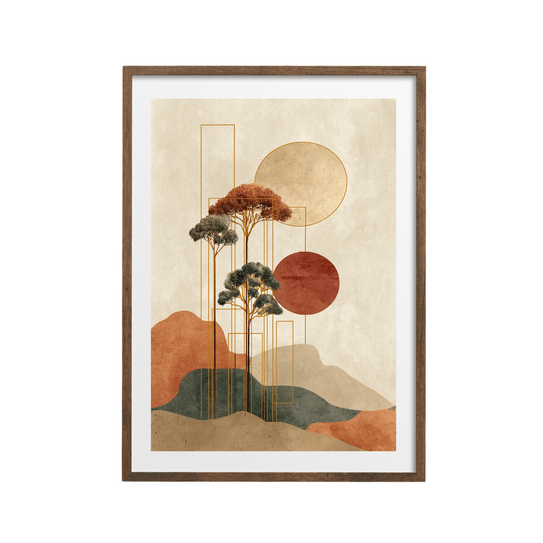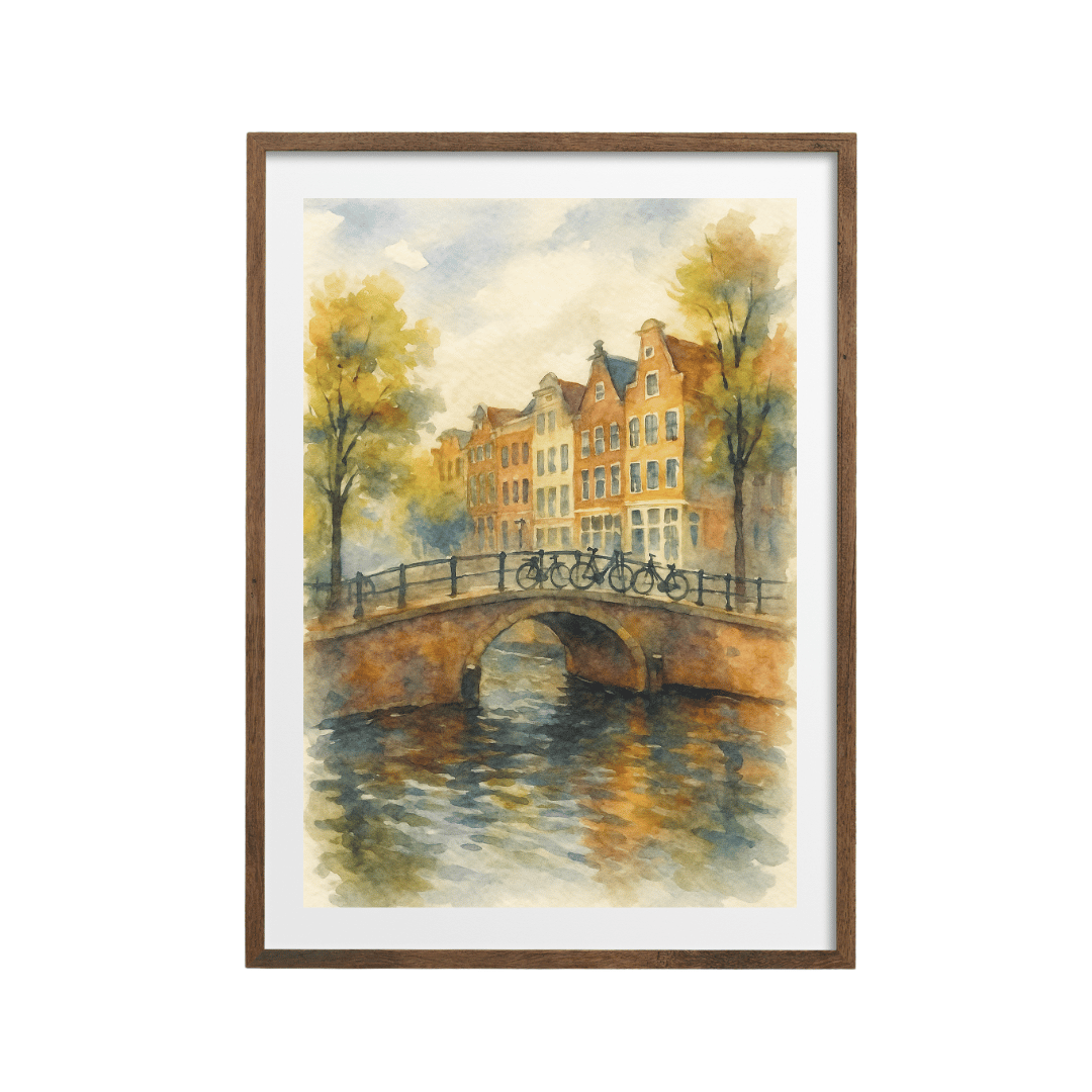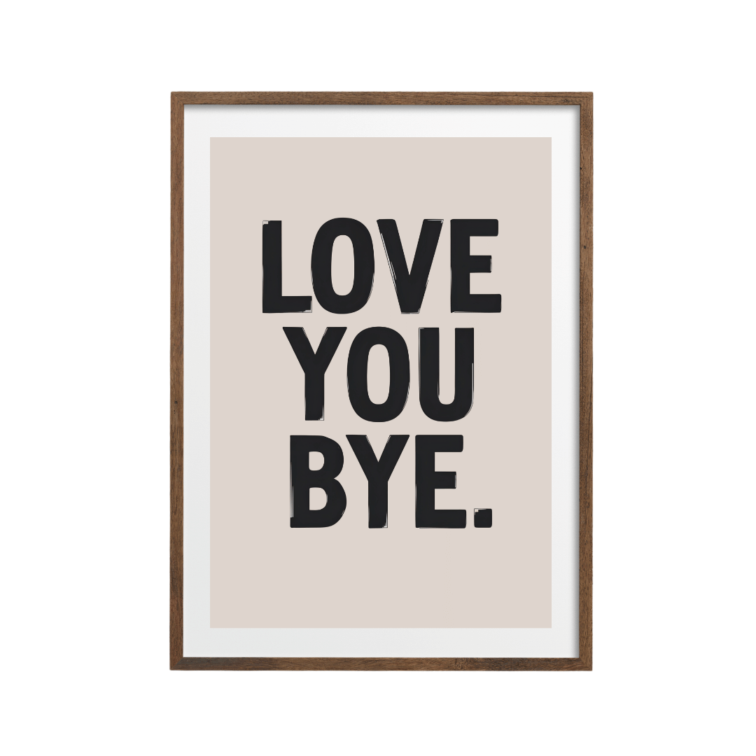



Mid century modern wall art is built on simple shapes (circles, arches, sunbursts and soft organic blobs) in a warm palette of mustard, teal, burnt orange and walnut brown. Pick one or two prints with clean geometry and plenty of background space, frame them in walnut, dark wood or black, and hang them over low, long furniture.
Mid-century modern is one of those styles that never really left. The furniture is everywhere, from tapered-leg sideboards to bentwood chairs, and the art that goes with it is easy to love: cheerful, graphic and uncomplicated. Get the shapes and colours right and a couple of prints can pull a whole room into the look, even if your furniture is a mix of old and new.
What makes wall art look mid-century?
The style comes from the middle of the last century, roughly the 1940s to the 1960s, and the art from that time shares a few clear traits. You don't need all of them in one print, but two or three will make it read as mid-century straight away.
- Flat areas of colour, with little or no shading
- Simple geometric shapes: circles, half circles, arches, rectangles, triangles
- Soft, organic forms that look like pebbles, kidney shapes or leaves
- Sunbursts and radiating lines
- Plenty of empty background, often in cream, off-white or a warm paper tone
- Slightly textured, printed or screen-printed surfaces
- Stylised landscapes, with mountains and trees reduced to a few shapes
The mid-century colour palette
The palette is warm and earthy, with one or two cooler accents to stop it getting muddy. These are the colours I look for.
| Colour | What it does | Pairs well with |
|---|---|---|
| Mustard and ochre | Warmth and sunshine; the signature mid-century colour | Teal, walnut, charcoal |
| Teal and petrol blue | Cool depth that balances the warm tones | Mustard, orange, cream |
| Burnt orange and rust | Energy and a retro glow | Teal, olive, cream |
| Olive and avocado green | Earthy calm | Orange, pink, walnut |
| Walnut and teak brown | Ties the art to the furniture | Everything above |
| Cream and off-white | The background that lets shapes breathe | Everything above |
A useful trick is to pick a print whose strongest colour matches something already in the room, like a mustard cushion, a teal armchair or an orange lamp. Then the art looks like it belongs.
The felted ovals print is almost a palette in itself, with stacked orange, mustard and teal pebble shapes on cream. The orange, teal and yellow circles print uses the same colours with overlapping round shapes.
Mid century modern wall art and Bauhaus geometry
A lot of what we now call mid-century graphic style grew out of the Bauhaus school in Germany, which favoured basic shapes, primary colours and a strong grid. Bauhaus-inspired prints are a bit more structured and bolder than typical mid-century art, and they mix with it beautifully.
Primary colours and hard edges
Where mid-century leans warm and soft, Bauhaus goes for red, blue, yellow and black with crisp edges. The Bauhaus geometric print stacks half circles and quarter circles in primary colours, and it looks particularly sharp in a black frame.
Circles on dark backgrounds
The abstract circles print puts red, cream and teal circles on a black ground. It's very simple and very graphic, which makes it a good choice above a walnut console or sideboard.
Sunbursts and pattern
Radiating designs feel unmistakably retro. The Align sunburst print combines a sunburst with folk-style triangles in orange, red and mustard. The dark orange and black geometric print takes a moodier route, with a symmetrical pattern that looks great in a dark wood or black frame.
Mid-century landscapes and travel prints
Not every mid-century print has to be abstract. Stylised landscapes, with a few flat shapes standing in for mountains, water and sky, were a big part of the look, especially on posters.
The sailboat, lake and mountain print uses pink peaks, a deep blue lake and a single small boat, and it has that relaxed holiday feel. The Roma 1974 geometric print treats a city as overlapping coloured blocks with handwritten lettering, which suits a hallway or study. If you like this direction, I've written more about framing travel posters as souvenirs.
For something more playful, the Groove wave print has 1970s energy, with rippling red and orange bands over chunky lettering.
How to style mid-century prints in a room
- Hang art over low, long furniture. Mid-century sideboards, consoles and sofas are low and horizontal, so a single large print or a pair side by side works better than one tall narrow frame.
- Choose walnut, dark wood or black frames. They echo teak and walnut furniture and the black legs of mid-century chairs. Oak works too in a lighter, Scandi-leaning version of the look.
- Keep the walls calm. Off-white, warm white, sage or a soft olive all let the shapes stand out. A mustard or teal feature wall can work, but pick art with plenty of cream in it so it doesn't disappear.
- Repeat a colour three times. If the print has teal in it, add a teal cushion and a teal vase. The repetition makes the scheme look planned.
- Leave space. Mid-century rooms feel uncluttered. Two or three well-chosen prints are better than a crowded gallery wall.
Sizes to aim for
Over a 160 to 180 cm sideboard, a pair of 50x70 cm prints with a 6 to 8 cm gap is a classic mid-century arrangement. Over a 120 cm console, one 50x70 cm print is enough. Most prints come in sizes from 13x18 cm up to 60x90 cm, so you can scale up for a long wall or down for a shelf.
Many prints offer black, white, wood and dark wood frames, or unframed if you have vintage frames you'd like to reuse. A thrifted teak frame with a fresh print inside is a lovely way to do this look on a budget.
Which rooms suit mid-century prints?
Living rooms are the obvious home, because that's where the sideboard and the low sofa usually live. But the style works in other rooms too.
- Dining rooms: a pair of geometric prints over the sideboard, or a single stylised fruit or still life print in a dark wood frame.
- Home offices: Bauhaus-style geometry is focused and orderly, which suits a desk wall. Black frames keep it crisp.
- Hallways: a travel or city poster at 30x40 cm or A3 makes a cheerful first impression.
- Bedrooms: choose the softer side of the palette, such as olive, cream and muted orange, and organic shapes instead of hard-edged primaries.
In a rented flat where you can't paint, mid-century prints in mustard and teal are one of the quickest ways to add colour to plain white walls.
Shop the look


Quick answers
What colours are mid-century modern?
Mustard, teal, burnt orange, olive and walnut brown, usually on a cream or off-white background, with occasional black and primary-colour accents.
What is the difference between mid-century and Bauhaus art?
Bauhaus art came first and is stricter, using primary colours, hard edges and a grid. Mid-century art borrowed its simple shapes but softened them with warmer colours and organic forms.
What frame suits mid-century wall art?
Walnut, dark wood or black frames suit the look best because they echo mid-century furniture. Light oak works for a Scandi version of the style.
Where should mid-century art hang?
Over low, long furniture like a sideboard, console or sofa. A pair of 50x70 cm prints side by side is a classic arrangement.
Can I mix mid-century prints with other styles?
Yes. They sit well with Scandi, Japandi and boho rooms. Keep at least one colour consistent between the prints and the furnishings.