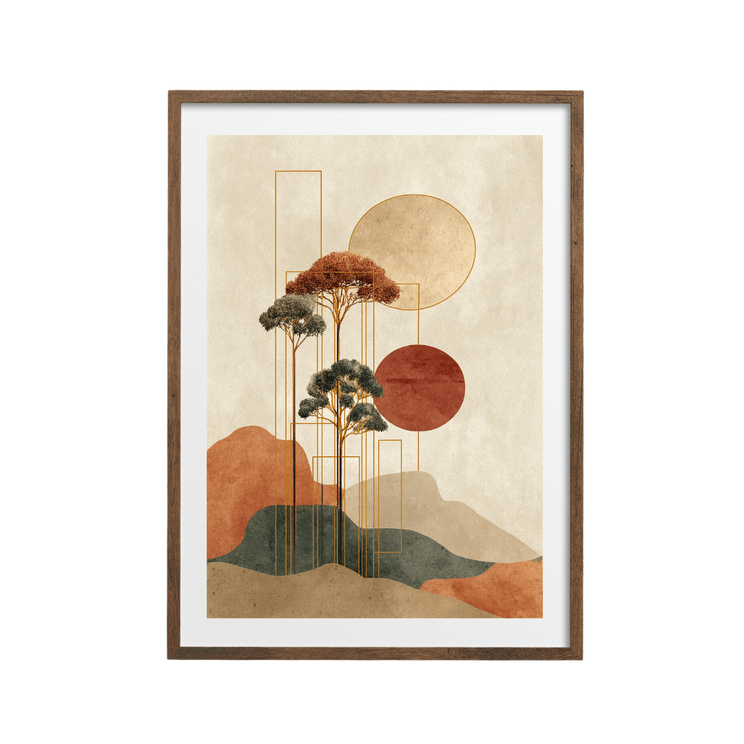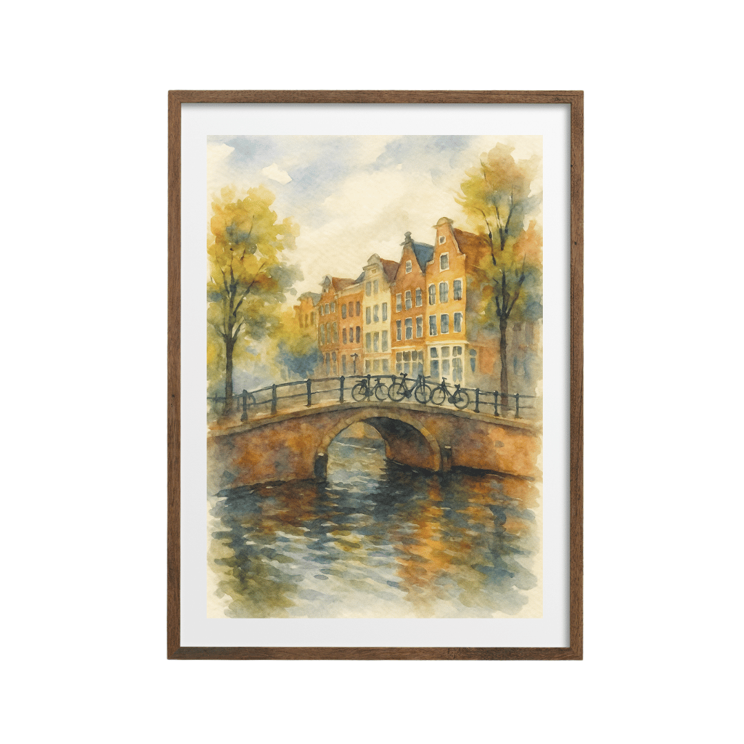






Most holiday souvenirs end up in a drawer. The fridge magnet falls off, the little ceramic thing gets chipped, and the thousand photos on your phone never get looked at again. A travel poster is different. It goes on the wall, you walk past it every day, and every so often it reminds you of a particular afternoon somewhere warm.
I like turning trips into a hallway or a staircase display for exactly that reason. Those are the spaces you pass through constantly, they're often a bit bare, and a run of places you've been gives them a story. Here's how I'd go about it.
Start with the places that mattered
You don't need a poster for every trip. Pick the ones that meant something: the honeymoon, the first holiday with the kids, the weekend away that turned into a running joke, the place your family comes from. Five or six is plenty to start with.
And don't overlook trips closer to home. A British seaside town can sit beside somewhere exotic and look just as good. The Filey travel poster has that classic vintage seaside look, and if Filey was where you spent every childhood summer, it'll mean more than any far-off city.

The same goes for the Glencoe watercolour poster if you've ever done a Highlands road trip in the rain and loved it anyway.
Group by colour or by trip
Once you have your places, there are two ways to make them feel like a set. Both work. It depends on whether you care more about how the wall looks or about the story it tells.
Grouping by colour
If you want the display to look calm and planned, choose posters that share a palette. Travel posters fall quite naturally into families. Seaside and Greek island prints tend to be blue and white. Southern European cities lean warm, with terracotta, ochre and sunset pinks.
A blue group could pair the Santorini watercolour with its blue domes with the Filey poster above. A warm group could combine the Seville poster of the Plaza de España and the retro Verona sunset skyline.

In a long hallway, you can run the blues at one end and the warm colours at the other, so the wall shifts gradually as you walk along it. I like that more than mixing them evenly, which can look a bit busy in a narrow space.

Grouping by trip
The other approach is chronological or by journey. A city break to Prague and London one year, Italy the next. This works especially well on a staircase, where the order of the frames can follow the order of the trips as you go up.
If you go this way, keep something else consistent so it doesn't look random. Same frame colour, same size, or the same style of poster (all vintage, for example, or all watercolour). The vintage Prague travel poster and the vintage-style London poster sit well together because they share the same vintage style.

Add dates and small mementos
This is what turns a set of nice posters into actual souvenirs. A few ideas I like:
- Write the month and year on the bottom of the mount in pencil. It's subtle, it looks handmade, and only people who look closely will notice.
- Tuck a train ticket, a boarding pass or a museum stub into the corner of the frame, between the mount and the glass.
- Use a deeper box frame for one or two of the trips, so there's room for a shell, a pressed flower or a coin beside the poster.
- Hang a small postcard you bought on the trip right next to the poster, in a little frame of its own.
Don't do all of these on every frame. Pick one approach and repeat it, or the display starts to look like a scrapbook.
Hanging on a staircase
Staircases are brilliant for travel posters because they give you a long wall that people look at slowly. They're also the trickiest wall in the house to hang well.
The simplest method is to follow the line of the stairs. Measure up from each step to the centre of the frame above it, and keep that measurement the same all the way up. Around 145 to 150 cm above the tread is a good starting point. That gives you a neat diagonal that runs parallel to the handrail.
Keep the gaps between frames even, around 5 to 8 cm, and use frames of the same size if you can. Mixed sizes on a staircase are possible, but they take a lot more planning. If you want to try it, cut paper templates first and tape them up so you can see how the diagonal works before drilling.
Hanging in a hallway
Hallways are easier. A single straight row at eye level works beautifully in a narrow corridor, with the centre of each frame at the same height. If the hall is long, leave a little more space between groups of trips to give the eye a rest.
In a wider entrance hall, a grid of four or six posters in identical frames looks smart and holds its own above a console table. Keep the whole grid about two-thirds the width of the furniture beneath it.
Leave space for the next trip
The best thing about this kind of display is that it keeps growing. Plan a gap at the top of the stairs or the end of the hallway for the places you haven't been yet. When you come back from the next holiday, you know exactly where its poster is going.
If you want to start with the trips you've already taken, the travel posters collection has a couple of hundred places to choose from, from British seaside towns to cities on the other side of the world.