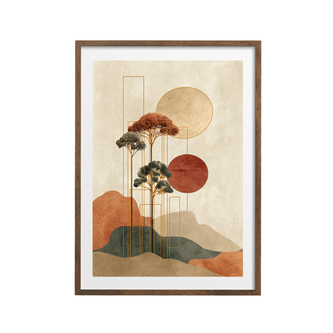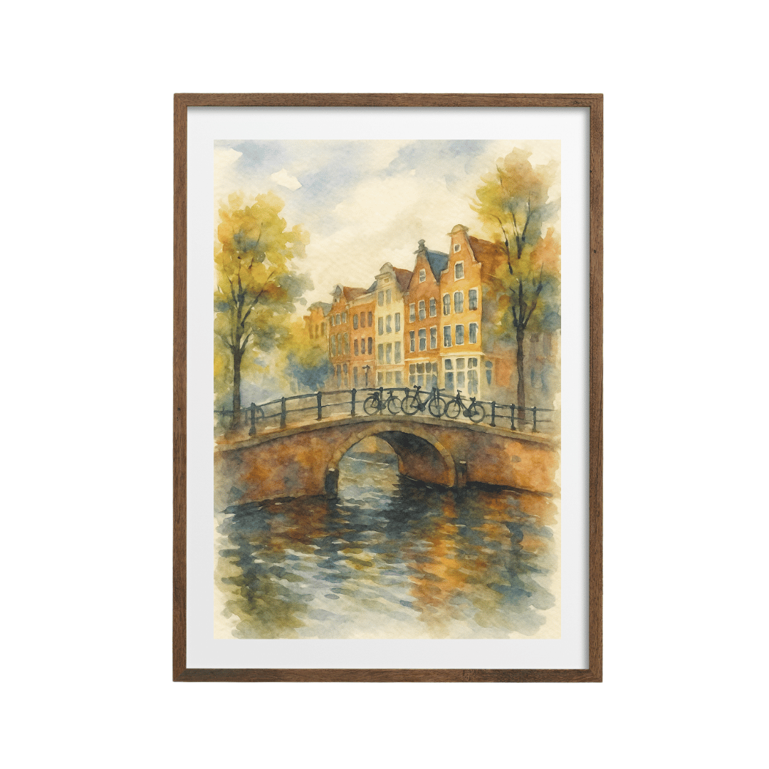


Boho wall art uses warm, earthy colours (terracotta, sand, rust, ochre and sage) and soft, natural shapes such as arches, suns, moons and botanical stems. Frame it in light oak or rattan-toned wood, group two or three prints with a woven textile or wall hanging, and keep the background walls warm white or plaster pink.
Boho is a relaxed, collected style, and the art is a big part of what makes it work. The best boho rooms look as if they've been put together slowly, from things picked up over time, with plenty of texture and nothing too precious. Prints are an easy way to get that feeling, because you can layer them with baskets, plants and fabrics without spending much.
The boho colour palette
Boho colours come from clay, sand, sun-baked plaster and dried plants. Almost everything is warm, softened and slightly muted.
| Colour | Where you'll see it | Works with |
|---|---|---|
| Terracotta and rust | Suns, arches, abstract figures | Sand, cream, sage |
| Sand and beige | Backgrounds, dunes, desert landscapes | Terracotta, black line work |
| Ochre and mustard | Sunsets, rising suns, accents | Rust, olive, cream |
| Sage and olive | Leaves, stems, botanical cut-outs | Terracotta, oak, linen |
| Blush and dusty pink | Moons, skies, soft abstracts | Gold, sand, rust |
| Charcoal and black | Fine lines, tree silhouettes, small details | Every colour above, in small doses |
Keep almost everything warm, and use black only as thin lines or small shapes. A big block of pure black or bright white can break the soft, sunlit mood.
Boho wall art motifs: arches, suns and botanicals
Arches
The arch is probably the most recognisable boho shape right now. It echoes doorways in Mediterranean and North African buildings and gives a print a calm, architectural feel. The minimalist boho arch print stacks a striped black arch over sand and taupe semicircles, which is about as neutral as boho gets.
Suns and moons
Suns turn up everywhere in boho art, usually as a simple circle in orange or ochre. The desert sun and tree print sets a pale sun against a warm yellow sky over grey hills. The tree silhouette with a large orange sun is bolder and works well as a single statement piece. For a softer, dreamier take, the gold landscape with a pink crescent moon mixes blush, gold and navy in layered hills.
Botanical stems and cut-out leaves
Pressed-flower and wildflower designs bring the natural, dried-plant side of boho. The wildflower and orange sun print combines a fine black botanical with a small terracotta sun, so it covers two motifs at once. The sage green botanical cut-out print has a more playful, paper-cut look with leaves, flowers and little arches.
Abstract figures
Simplified women's figures in earthy colours are a boho favourite, especially in bedrooms. The abstract woman in terracotta and beige and the minimalist woman with a striped ochre dress both use flat shapes and a warm palette that suits linen bedding and rattan headboards.
How to style boho wall art
- Start with warm walls. Warm white, soft cream, plaster pink or a muted clay colour suit boho art better than cool brilliant white. If you can't paint, warmer bulbs (around 2700K) help a lot.
- Choose light wood frames. Oak or natural wood frames echo rattan, cane and jute. Many prints offer black, white, wood and dark wood frames, and for boho I'd go wood almost every time.
- Group in twos and threes. A pair of 30x40 cm prints side by side, or a trio of mixed sizes, feels more collected than one big piece on its own.
- Mix in texture. Hang a woven wall hanging, a macramé piece, a rattan mirror or a small basket alongside your prints. The texture is what turns a few earthy posters into a boho wall.
- Add plants. A trailing plant on a shelf beside the art, or a tall potted plant next to a sideboard, softens the edges.
Mixing prints with a textile
The quickest way to make a print wall look boho is to put a textile next to it. Prints are flat; textiles bring depth, shadow and softness.
Layouts that work
- One 50x70 cm print with a woven hanging of a similar height beside it, with 8 to 10 cm between them.
- Two 30x40 cm prints stacked vertically on one side, with a longer macramé or tasselled hanging on the other.
- A rattan or round woven mirror in the centre, flanked by a pair of matching A3 or 30x40 cm prints.
- A draped throw over a ledge or the back of a chair below the art, picking up one colour from the print.
Pick a textile in a natural tone (cream, oat or sand) so it doesn't fight with the colours in the prints. Then let the art carry the terracotta and sage.
Boho on a gallery wall
Boho suits a loose, informal gallery wall. You can mix frame sizes, add a small woven piece, and include one or two prints that don't quite match. The trick is to keep the palette tight. If every piece has at least one warm earth colour in it, the wall will hold together. I've written a full guide to building a gallery wall from prints that don't match if you want to try it.
Boho mistakes to avoid
- Too many motifs at once. A sun, a moon, an arch, a feather and a cactus on one wall stops looking relaxed and starts looking themed. Pick two motifs and repeat them.
- Cool white frames on warm walls. Bright white frames can look stark against plaster tones. Wood or a soft off-white is kinder.
- Prints that are too small for the wall. Boho is casual, but a lone A4 print above a large sofa still looks lost. Group it or go up to 50x70 cm.
Which rooms suit boho prints?
- Bedrooms: abstract figures, moons and soft botanicals over a linen-covered bed. Hang a pair centred over the headboard with the bottom of the frames 20 to 25 cm above it.
- Living rooms: one larger sun or landscape print over the sofa, with a textile or plant beside it.
- Hallways: a single arch or botanical print at 30x40 cm and a small woven basket for keys underneath.
- Reading corners: one small print at seated eye level, about 120 cm to its centre, beside a cane chair.
Boho also overlaps with Japandi, with both relying on natural materials and calm colour. If your taste sits somewhere between the two, my piece on Japandi on a UK budget covers the quieter end. You'll find more in the abstract art collection and the botanical prints collection.
Shop the look


Quick answers
What colours are boho wall art?
Mostly warm earth tones: terracotta, rust, sand, ochre and sage, with touches of blush and fine black lines.
What frame goes with boho prints?
Light oak or natural wood frames, because they echo rattan, cane and jute. A white mount keeps the look light.
How do I make a boho gallery wall?
Mix two to five prints in earthy colours with one woven or macramé piece, keep 5 to 10 cm gaps, and make sure every print shares at least one warm colour.
Is boho art still in style?
The earthy palette and natural textures are still popular. Simple arches, suns and botanicals feel current, while heavy dreamcatcher and feather motifs can look dated.
Can I mix boho prints with mid-century furniture?
Yes. Both styles share warm colours and wood tones. Choose prints with clean shapes, like arches and suns, to bridge the two.